Showing posts with label Glitz Design. Show all posts

Wednesday, February 19

capture the moment

hello crafty friends!

and welcome to ROUND 2 of the SUPREME SCRAP TOURNAMENT 2014!

this week the challenge is "MONOCHROMATIC colour layout".

 the details:
create a double page layout;
use only one colour on your project;
one photo must be partly on the left and partly on the right page;
at least one photo needs to be black and white
not allowed - black colour in any embellishment, paper and/or medium;
 deadline - FRIDAY, february 19th, 21:00 CET

and here is my take on this challenge -

"CAPTURE the MOMENT"


to create my project i used the picture of the last photo session of my pretty niece WILLY - isn't she adorable! because of the light colour palette of her pictures, i thought that PINK would be the perfect colour for my double-pager.

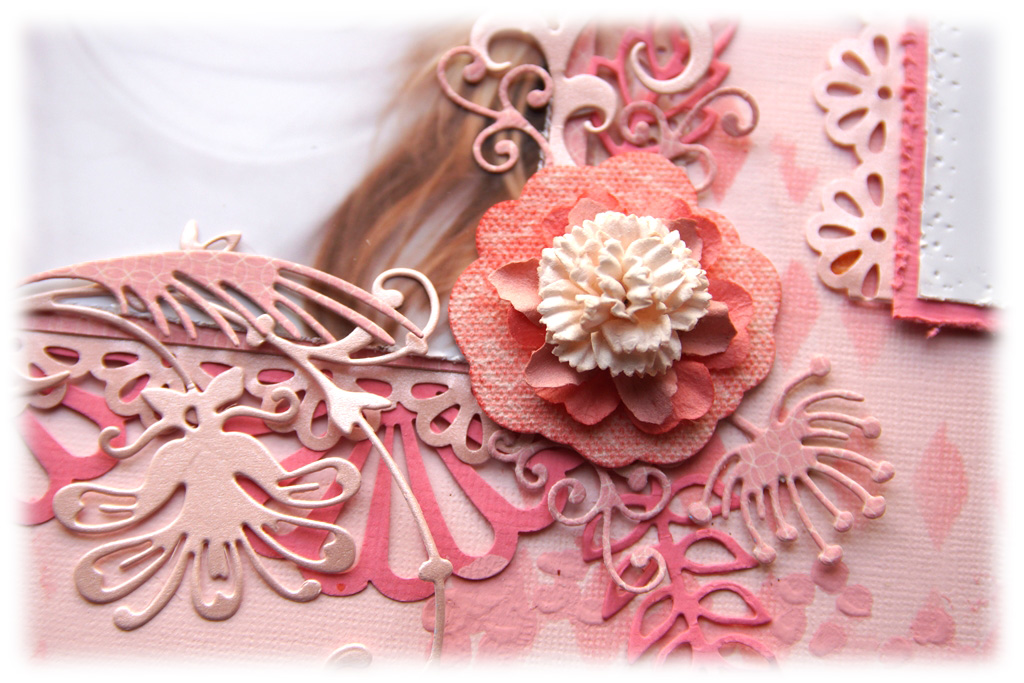
here is a close up of page #1: 


to alter my background i used various stamps, masks and art mediums. i started with THE CRAFTER'S WORKSHOP mini mask "harlequin" and TIM HOLTZ' "worn lipstick" distress ink. then i added another layer, using PRIMA marketing "flower" mask with RANGER INK "spun sugar" paint dabber.

i added a few "coffee stains" with TIM HOLTZ' "fired brick" distress ink and a masking template and to finish off my design, i stamped the elegant corners with GLITZ DESIGN "afternoon muse" clear stamps and pink embossing powder and i sprinkled pink glimmer glam on my background.


to create the flower clusters i used various PRIMA marketing blossoms {e-line flowers fuchsia and pink mix; mini roses and whisper fabric flowers "celebrate jack and jill"}. i layered the blossoms on large canvas flower embellishments {also from PRIMA marketing} and decorated them with leafy die cuts {MARIANNE DESIGN dies}.


i mixed two paper collections to create my layout - PRIMA marketing "fairy rhymes" and MY MIND'S EYE "penny lane - feeling groovy". 

for the banner i used DIE-VERSIONS "whispers - party pennants 2" die and SPELLBINDERS "nested lacey pennants" die.


i used different pattern papers to create the layers under my picture. to decorate their edges i used MARTHA STEWART punches - deep edge punch "daisy fan", punch around the edge "mini daisy" and "vintage floral".


and page #2: 


for my title i used CREATIVE EMBELLISHMENTS "capture the moment" chipboard set. i altered the chippies with a layer of pink paint first and then i added a second layer of RANGER INK "fired brick" crackle paint to give it an unique vintage look. 


for my background i used pink cardstock and the same art mediums and masks as on the first page.


i added small resin roses to my banner to connect the large pennants.


the cute photo cameras are also from the CE chipboard set.


i hope you enjoyed today's post!

see you in a few days!

hugs 'n smiles,


Friday, May 17

enjoy the journey {PAPERHAUS magazine}

hello scrappy friends!


i can't believe that it has been that long since my last post! it is vacation time here in HOLLAND and i took the two free weeks my kids had from school to visit my home country - BULGARIA. 

one thing lead to another and we ended up in GREECE with my sister, celebrating EASTER:-)

but i will make up for it! :-) i'm sure you have heard of the PAPERHAUS magazine by now... and here is one of the recent projects i made for them -

"ENJOY the JOURNEY"


i based my layout on the PAPERHAUS may 2013 sketch, created by the very talented TRINA McCLUNE:


for my layout i used K & COMPANY "sea glass" collection and a lot of different stamps and dies.

the title is stamped with FABER-CASTELL stampers big brush pen en TIM HOLTZ "just thoughts" stamp set. for the fancy corners i uses GLITZ design "afternoon muse" clear stamps.


the subtitle is also from TIM HOLTZ. i doodled the edges of my banners with PITT ARTIST PENS to create a deeper visual effect.


all the embellishments are die cut or fussy cut of the pattern paper. i used various cutting dies - SPELLBINDERS "picot circles" and "fancy tags two" {i cut the tag in two to frame my pictures}.


the banners i cut by hand. that's why they all are unique :-)


as per last month we're very excited to share the blog with a guest designer who participated in one of our sketch challenges!

all you need to do is complete a layout using the may sketch and post it under PAPERHAUS' original blog post.

i hope you will join us this month!

hugs 'n smiles,
Emmy

Monday, April 1

never stop DREAMING {DT work for the PAPERHAUS magazine}

hello scrappy friends!

it's a new month and i've got so many exciting news, but i can't share them just yet...

so, i'll show you what i can share - my newest layout for the PAPERHAUS magazine - 

"never stop DREAMING"


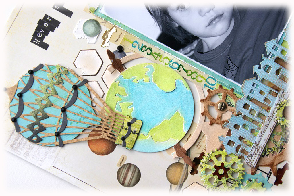
to create this layout i combined two GLITZ DESIGN collections – “hoopla” and “laced with grace”, which at first glance are very different, but they actually look pretty good together.

i begun by creating my background using DONNA DOWNEY and PRIMA marketing masks, modeling paste and TIM HOLTZ "tea dye" distress ink. 


i outlined some of the honey combs with FABER-CASTELL pitt artist pen and drew the frame.

i wrote the title with two different alphas from PRIMA marketing. i used a lot of different washi tapes to embellish my page, but my favourite one is the solar system one!


to create the cogs i used TIM HOLTZ "gadget gears" and SPELLBINDERS "sprightly sprockets" cutting dies. and i just loved the calendar cardstock sticker from GLITZ DESIGN - it made it pretty easy to record the exact date my picture was taken. 


i used TIM HOLTZ "townscape" on  the edge cutting die and WE R MEMORY KEEPERS "play time" self adhesive foil tape to embellish my picture. 


the globe is cut with TIM HOLTZ "vintage globe" die and for the hot air balloon - X-CUT "vintage hot air balloon" die.


i hope you enjoyed today's post!

have a lovely week!

hugs 'n smiles,
Emmy