Showing posts with label Words or Whatever. Show all posts

Friday, January 31

programmed for mischief {MERLY IMPRESSIONS & KAISERCRAFT}

hello scrappy friends! 

 today i would like to share a brand new layout with you, which i created for MERLY IMPRESSIONS, using the amazing KAISERCRAFT “garage days” collection.
i thought this paper line will fit my picture perfectly!

"PROGRAMMED FOR MISCHIEF"


to create my background i used the nuts and bolts pattern paper from the garage days collection, the crafter's workshop masking template with harlequin design and TIM HOLTZ “broken china” distress ink pad. after the ink has dried i added additional structure with PRIMA marketing "stars" masking template and white modeling paste.


then i cut the shield gloss die cut paper in two and added the red half to the side of my layout, after i distressed its edges.

to create the banner and most of the embellishments i used the COLLECTABLES pack from the same collection. i tied the banner and the tags with TIM HOLTZ idea-ology paper string – black and white.


to build LUIGI'S tire tower i used also cardstock die cuts from the COLLECTABLES pack.


 for my title i used a WOW chipboard title "programmed for mischief". i altered it with SPARKLE N SPRINKLE buttercup petal [EP389] and pool side [EP393] embossing powders.


i distressed the edges of my pictures and layered it on a 10 x 15 cm KAISERCRAFT coconut weave cardstock and a 11 x 16 cm piece from the tire shop pattern paper.


for the black film strips i used TIM HOLTZ sizzlits decorative strip die "filmstrip frames". i embssed the inner parts with TIM HOLTZ "blueprint and gear set" embossing folders and placed them back in the filmstrip. 


here is a complete list with the products i used on this page:


 thank you for visiting my blog today!

i really appreciate your sweet words and comments!

hugs 'n smiles,


Friday, July 19

color combo challenge #248

hello crafty friends! 

the new color combo #248 is LIVE! the colors this week are pistachio - taupe - soft blue - light grey - peach and here is what i came up with -

"your SMILE" 


 i based my layout on color combo #248: sweet serenity 


 i used all five colours from the colour palette on my page. my creative boost came from inspiration photo #1: focus on product: twine {wrapped twine around the layout}. other inspiration: inspiration photo #3: various clocks and punched paper edges edges (idea: the clock and the filigree silver edge); inspiration photo #4: banners and buttons {idea: green banner and small buttons}; inspiration photo #2: different sized cogs {idea: flowers}. 

and here are some close ups from my project: 

i started with a white cardstock, PRIMA marketing "clocks" 12x12" stenciled mask and modeling paste.


after the paste has dried, i used light grey PANPASTELS to colour the dimensional clocks. i cut of 1cm from each side of the white cardstock, distressed the edges with TIM HOLTZ' "broken china" ink pad and layered it on green pattern paper. 


i used WEBSTER'S PAGES "new beginnings" collection. the designs are amazing and i could embellish my page just by fussy cutting the cute elements from the pattern papers.


the amazing chippie is from WORDS or WHATEVER "clock and gear corner". i covered the clock with embossing powder first to create the distressed look and then i coloured the chippie with distress ink.


i cut the cogs from cardstock using TIM HOLTZ' "movers and shapers cogs" die. i colored them with distress ink "broken china" and "shabby shutters'.


for the title i used pattern paper and WEBSTER'S PAGES alphabet stickers.


thank you for joining me today!

and don't forget the deadline for this colour combo is july 28th, 2013. for more detailed information, visit COLOR COMBOS GALORE website.
i hope you will join us at CCG!

hugs 'n smiles,
Emmy

Friday, July 12

color combo challenge #247

hello crafty friends! 

the new color combo #247 is LIVE! the colors this week are red - coral - wheat - goldenrod - seafoam and here is what i came up with - 

"LOVE this look" 


i based my layout on color combo #247: caribbean dreams

 
  i used all five colours from the colour palette on my page. my creative boost came from inspiration photo #1: focus on design: clustered elements {clustered accordion paper flowers}. 

other inspiration: inspiration photo #1: accordion paper flowers (idea: cake flowers); inspiration photo #2: washi tape flag strips {idea: flag strip name tag}; inspiration photo #3: cogs {idea: circle doilies}; inspiration photo #4: banner, repetition of the same elements {idea: garland}.

and here are some close ups from my project:

i started with a white cardstock, THE CRAFTER'S WORKSHOP "harlequin" 12x12" doodling template and panpastels. 


after the fixative spray has dried, i used THE CRAFTER'S WORKSHOP "mini harlequin" and "mini tile texture" 6x6" templates with modeling paste to add dimension to my background.

i did a lot of stamping using BOBUNNY's mixed media clear stamp sets and different colours RANGER ink pads.


the paper collection i used is from WEBSTER'S PAGES - modern romance. i fussy cut, embossed and die cut the pattern sheets to create my embellishments. 


the chipboard elements are from WORDS or WHATEVER. i used the arrow pack WOW1828. i covered the chippie with gesso and after it dried, i covered it with TIM HOLTZ crackle paint. 


for the accordion flowers i used pattern paper and TIM HOLTZ rosette die.


the little cameras are made with the DIE-NAMICS "cute cameras" die.


for my title i used another WOW chipboard from the "life elements word pack 3" WOW1874. i layered it on a stamp die cut, which i made with MARIANNE DESIGN die. the negative of this die cut, i used as a frame around my picture.


for the cogs i used SPELLBINDERS sprightly sprockets die.


the banner is also cut with a SPELLBINDERS DIE.


thank you for joining me today! 

and don't forget the deadline for this colour combo is july 28th, 2013. for more detailed information, visit COLOR COMBOS GALORE website.

i hope you will join us at CCG! 

hugs 'n smiles, 
Emmy

Wednesday, April 10

PAPA, niet plagen {scrapbook challenges}

hello scrappy friends!

today i've got a brand new layout to share with you. this one i made for SCRAPBOOK CHALLENGES and the new weekly sketch - 

"PAPA, niet plagen"


i based this layout on SC sketch #339:


i'm also entering the march WOW puzzle challenge

the challenge was to use all four elements on your creation plus a WOW chippie of course. i used the DONNA DOWNEY "hexagon grunge" mask and another mask for the paint splashes.

the swirly chippie is from WOW. i altered it with brown embossing powder.


to create my background, i used two different masks, TIM HOLTZ "dried marigold" and "tumbled glass" distress ink pads. after the ink was dry, i outlined some of the hexagons with FABER-CASTELL pitt artist pens - orange and brown.


for my title i used SIZZIX alphabet dies and PRIMA marketing alpha stickers.


i used PRIMA marketing washi tape two and six sets to decorate my page.


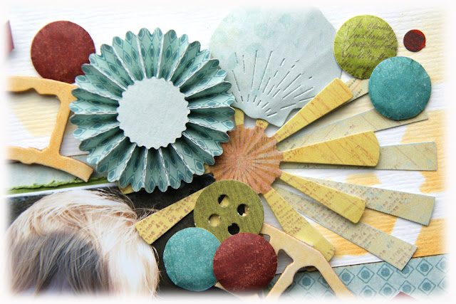
for the paper rosettes i used TIM HOLTZ' "mini paper rosettes" die and for the shell - PROVO CRAFT "from the sea" die cutting set.


the paper is from MY MIND'S EYE "good day sunshine" collection kit, as well as the most of the cut outs.


i hope you enjoyed today's post!

I can't wait to see your take on the SC sketch in the gallery!

hugs 'n smiles,
Emmy