Wednesday, July 17

BO BUNNY mini album {PAPERHAUS}

hello scrappy friends! 

today i would like to share a mini album i completed for the PAPERHAUS magazine

i started creating this album as a gift to my goddaughter – EMMA. she is the most adorable 6-years old girl and she is very creative. she is always busy drawing, gluing, assembling little pieces of children’s’ art. so, while assembling the pages i thought how can i add some extra space, so she can keep her drawings and her pictures in the same album… 

and here is what I came up with – hidden pockets, decorated flips and extra picture / journaling space. 

here is detailed information with photoes on how to add extra space to your mini album. 

{with a paper flip}


 i added extra space to this page, by adhering a paper flip. i decorated the edge with TIM HOLTZ edge die "butterflies" and added various embellishments. 

and here is when it is open: 


i used BOBUNNY mixed media clear stamp sets to design my background. the lovely punched border is made with MARTHA STEWART "lace doily" edge punch. for the flourishes around my flowers i used various MARIANNE DESIGN dies and BOBUNNY pattern paper.


{with a cardstock accordion} 


i attached the cardstock accordion with double sided tape and to keep it in place i used brads and metal fasteners.

i decorated the cover of the paper accordion with pattern paper, die cut frame made with a SPELLBINDERS die. the sentiment is from TIM HOLTZ cling stamps.


and this is the page next to it:


{with hidden pockets}


i used vintage images from my stash to indicate where the hidden pockets are. you can use them to store pictures, different memorabilia, etc.

to decorate this page i used MARTHA STEWART "butterflies" edge punch; TIM HOLTZ stamps and RANGER glitter glue and liquid pearls.


i stamped the corner with GLITZ design clear stamps and added brown embossing powder.


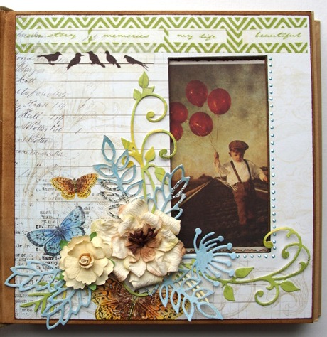
for the last page in my album i choose a more classic design - flowers, flourishes and washi tape. most of the flowers are from PRIMA marketing and the washi tape is from WEBSTER'S PAGES. 


i hope you like today's post!

have a wonderful crafty day!

hugs ‘n smiles, 
Emmy

Friday, July 12

color combo challenge #247

hello crafty friends! 

the new color combo #247 is LIVE! the colors this week are red - coral - wheat - goldenrod - seafoam and here is what i came up with - 

"LOVE this look" 


i based my layout on color combo #247: caribbean dreams

 
  i used all five colours from the colour palette on my page. my creative boost came from inspiration photo #1: focus on design: clustered elements {clustered accordion paper flowers}. 

other inspiration: inspiration photo #1: accordion paper flowers (idea: cake flowers); inspiration photo #2: washi tape flag strips {idea: flag strip name tag}; inspiration photo #3: cogs {idea: circle doilies}; inspiration photo #4: banner, repetition of the same elements {idea: garland}.

and here are some close ups from my project:

i started with a white cardstock, THE CRAFTER'S WORKSHOP "harlequin" 12x12" doodling template and panpastels. 


after the fixative spray has dried, i used THE CRAFTER'S WORKSHOP "mini harlequin" and "mini tile texture" 6x6" templates with modeling paste to add dimension to my background.

i did a lot of stamping using BOBUNNY's mixed media clear stamp sets and different colours RANGER ink pads.


the paper collection i used is from WEBSTER'S PAGES - modern romance. i fussy cut, embossed and die cut the pattern sheets to create my embellishments. 


the chipboard elements are from WORDS or WHATEVER. i used the arrow pack WOW1828. i covered the chippie with gesso and after it dried, i covered it with TIM HOLTZ crackle paint. 


for the accordion flowers i used pattern paper and TIM HOLTZ rosette die.


the little cameras are made with the DIE-NAMICS "cute cameras" die.


for my title i used another WOW chipboard from the "life elements word pack 3" WOW1874. i layered it on a stamp die cut, which i made with MARIANNE DESIGN die. the negative of this die cut, i used as a frame around my picture.


for the cogs i used SPELLBINDERS sprightly sprockets die.


the banner is also cut with a SPELLBINDERS DIE.


thank you for joining me today! 

and don't forget the deadline for this colour combo is july 28th, 2013. for more detailed information, visit COLOR COMBOS GALORE website.

i hope you will join us at CCG! 

hugs 'n smiles, 
Emmy

Monday, July 8

color combo challenge #246

hello crafty friends! 

the new color combo #246 is LIVE! the colors this week are grey - red - buff - light blue - space cadet and here is what i came up with - 

"two girls in LONDON"


 i used all five colours from the colour palette on my page. 
my creative boost came from inspiration photo #4: focus on theme: postal / air mail (i created a travel layout, using postal themed papers, images and stamps). 

 other inspiration: inspiration photo #1: framed background (idea: checkerboard design); inspiration photo #2: red glitter stickers and flourishes (idea: glittered letters). 

and here are some close ups from my project:

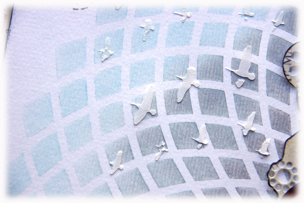
i started with white cardstock, THE CRAFTER'S WORKSHOP "solace" doodling template and panpastels - light blue and light grey.


after the fixative spray has dried i added dimensional birds with modeling paste and THE CRAFTER'S WORKSHOP "flying geese" mini template.


i did a lot of stamping using PAPERMANIA's "portobello road" stamp set and MAKING MEMORIES travel stamp set.


the lovely papers are also from PAPERMANIA's "portobello road" collection.


 i used a lot of stamped images to decorate my picture. 


the red glittered letters are from MAKING MEMORIES sticker alphabet. 


i hope you enjoyed today's post!

thank you for visiting me! and don't forget the deadline for this colour combo is july 28th, 2013 but remember this week's GALLERY FAVES will be chosen for entries received by july 11th. 

for more detailed information, visit COLOR COMBOS GALORE website. 

i hope you will join us at CCG! 

hugs 'n smiles, 
Emmy

Sunday, July 7

die-versions JULY 2013 release

hello scrappy friends! 

it is time for the DIE-VERSIONS' july 2013 release - "ALL STAR"!


nineteen dies, perfect for anyone with a young athlete, a retired athlete, an armchair quarterback or a sports fan.

and here is what i created with some of these amazing dies -


i used three NEW dies in a monochromatic color scheme - soccer cone orange to create this card!

i started with a 13 cm square orange card. i used the NEW "superstar" express edges to create my sentiment, then i cut several layers of the NEW "soccer border" whispers die for the grass field.  as a final touch i used the NEW "Whistle" Sweet Petites die, grunted up a bit with some field dirt {or ink - either one!}.

if you wish to see more samples created with this amazing new release, please visit the DIE-VERSIONS blog.

we're also pleased to be introducing a new release night feature tonight. short little videos, that will feature one die, and only one die, at a time.

we're calling them "DETAILS".


all of these "DV details" videos can be seen on our DIE-VERSIONS crafting youtube channel, but they will  also be linked here on the blog. feel free to share these videos, send them to friends and scrapping buddies, or post them on your local scrapbook store's facebook page and say "i want these!!" :-)

have a great week!

hugs 'n smiles,
Emmy

Saturday, July 6

2 of a kind {the PAPERHAUS magazine}

hello scrappy friends!

well, most of you probably know that i'm a vet, and as such, i know the anatomy of almost any animal kind. but what i did not expected when i began crafting is that on day i'll be writing about the "anatomy" of a layout.

today, i've decided to prepare a small tutorial on how to create a page from scratch or how my creative mind works. and hopefully i’ll manage to inspire you a little and save you some time in the busy summer months ahead -

"2 OF A KIND"


here is the "dissection" of my creative process:

step 1: pick up a picture – the most difficult part for me… since we've got our first digital camera {about 15 years ago} we've got a constant picture overflow and it is getting worse…


i really LOVE this picture of my daughter and hubby - they look just like they always do - happily challenging each other.

step 2: choose the papers - though the MY MIND'S EYE "hip hooray" collection is for birthday celebrations, i thought the colours will look perfect with my picture.


step 3: prepare the main layers


step 4: cut the paper into shape. i distressed the red cardstock a bit, because it was too bright and stamped an edge on it. 


step 5: begin altering the white background - i used THE CRAFTER'S WORKSHOP "solace" 12"doodling template and PANPASTELS. i used Glimmer Glam for the spatters. 


step 6: gather all the elements together and begin arranging your deign. 


and this is the final result:


here are some close ups of my page:


i hope i managed to inspire you today!

make sure to check the PaperHaus blog for more inspiration from our design team!

hugs 'n smiles,
Emmy

Wednesday, July 3

tutorial with gesso, gelatos and punchinella {FABER-CASTELL}

hello crafty friends!

it's my turn as a GUEST designer at FABER-CASTELL design memory craft blog today and my projects is all about gesso, GELATOS and punchinella. 


if you are interested in my complete post, please visit FABER-CASTELL design memory craft blog today.

and just to get you more curious - here is another sneak peek of my project - my TIM HOLT inspired title made with art GRIP® aquarelles and PITT® artist pens.


have a lovely creative week!

hugs 'n smiles,
Emmy